— Selected Work
Projects that prove data can be beautiful.
From marketing analytics to future governance tracking — every project made verimuch more powerful.
VeriMuch makes data more understandable, visually beautiful and functional. Marketing analytics, financial summaries, research results — all verimuch more powerful than ever.
We are VeriMuch — a data analysis and visualization studio based in İstanbul. Our main purpose is simple: make data more understandable, visually beautiful and functional for everyone who works with it.
We love data. We love working with it, exploring it, and sharing that passion with our clients. Whether it's marketing analytics, financial summaries, or research results — we turn numbers into narratives that move people to act.
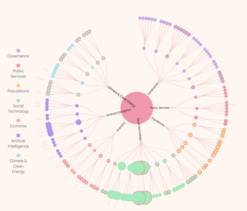
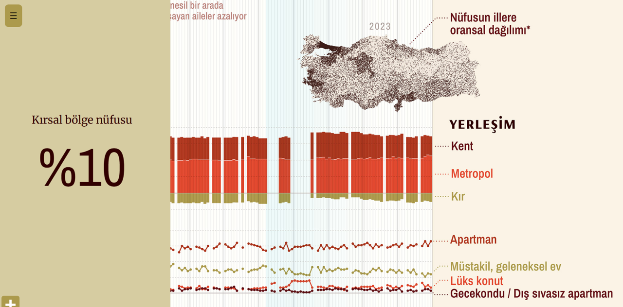
From bubble charts tracking future governance to scrollable deep-dives into market trends — every project gets the same creative energy and analytical rigor. Data should be beautiful. We make it so.
We don't just design charts. We build data communication systems that make complex information feel intuitive, beautiful, and actionable.
01 —
Real-time dashboards built with modern web technologies that give your team instant clarity. From marketing KPIs to financial performance — integrated with your existing data stack.
02 —
Turn campaign data, audience insights, and channel performance into visual stories your whole team can act on. Beautiful reports that actually get read.
03 —
Survey results, academic findings, and policy research made vivid. We make complex research accessible to any audience — from academics to the public.
04 —
Annual reports, investor decks, and budget visualizations that communicate financial stories with precision, clarity, and visual authority.
05 —
Animated data presentations for video, conferences, and digital publications. We sequence information so every frame earns its place.
06 —
Scroll-driven narratives that guide readers through complex data one revelation at a time. Our most powerful format — 3× more engagement than static reports.
07 —
Share our passion for data with your team. Hands-on workshops in data visualization principles, modern web technologies, AI-assisted design, and visual communication strategy.
08 —
We embed AI into every stage — from rapid concept generation to automated data cleaning and layout iteration. This means faster delivery, smarter design decisions, and more polish for your budget.
The most complex data becomes effortless when you control the pace. Our scroll-driven narratives turn passive reading into active discovery.
— Live preview / scroll to explore
Step 01 — Raw Data
Thousands of data points with no visible structure. Overwhelming to look at, impossible to present to a board, a press room, or the public. This is where most visualization stops.
Step 02 — Structure Emerges
Through clustering, sizing, and color encoding, patterns emerge from the chaos. Groups cohere. The data begins to tell its own story — and the reader leans in.
Step 03 — Story Unfolds
Annotations appear at exactly the right moment. Context wraps each discovery. The reader is guided through your most important findings at a pace that lets comprehension keep up.
Step 04 — Action Follows
By the final scroll, your audience doesn't just see the data — they feel the conclusion. Scrollytelling generates 3× more time-on-page and dramatically higher conversion than static reports.
From marketing analytics to future governance tracking — every project made verimuch more powerful.
Refined across 100+ projects — our methodology delivers clarity, speed, and visual excellence every time.
We audit your data, understand your audience, and define the single most important question your visualization must answer.
Chart selection, layout exploration, color system design. We prototype fast and test multiple directions before committing.
Production-grade development using modern web technologies and AI-assisted workflows — optimized for performance, accessibility, and longevity. Built to integrate with your stack.
Deployment, documentation, and a 60-day post-launch partnership to iterate based on real user behavior and feedback.
From global research firms to beloved Istanbul institutions — we've helped them all tell sharper stories.
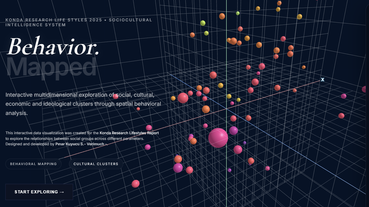
Konda Research
Research & Analytics
Bilgi University
Academia
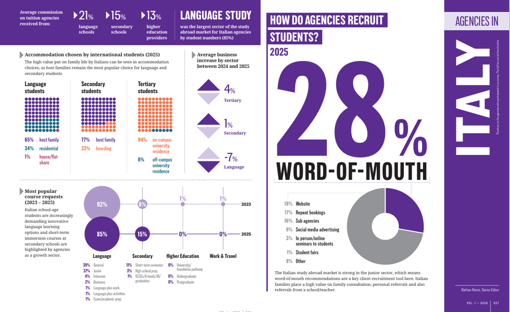
Study Travel
Education Media
Istanbul Yelken Club
Sports & Events
World Economic Forum
Global Policy
Toplum Gönüllüleri
NGO / Vakıf
Istanbul Policy Lab
Think Tank
RetailTech A.Ş.
E-commerce
And more...
100+ Projects
Startups · NGOs · Government · Academia · Media · Finance
Whether you have a live dataset or a rough idea, we'll help you find the most powerful way to communicate it. Free 30-minute discovery call — no pitch, just ideas.